Workspace Overview
Login
Rival One can be accessed from any workstation with internet access and will always require two-factor authentication (2FA) in order to maintain security. Once the app has been launched, the user will be required to enter the email address registered with Rival as the username. While there is no password required, once the username has been entered, an email will be sent to the same address, containing a verification code. The verification code can be re-sent if it is not received immediately but must be entered within 10 minutes of receipt.
Once the verification code is entered, the user’s workspace will open. If this is the first time a workspace is opened, a blank Default page will be presented. If the user has an existing workspace, that workspace will open with all windows and components in the same configuration as when it was last closed by the user.
Overview/Windows
A workspace is made up of one or more windows that contain individual components selected by the user according to their preferences. It contains a main window, named Default. Additional windows can be created with custom names by clicking the + sign in the top left corner of the workspace.

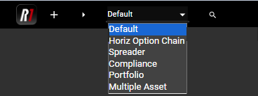
All windows will be listed in the drop down menu in the main toolbar. Users can quickly switch between workspace windows using this menu.
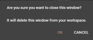
Once a window has been named, it can be re-named by double clicking on the name and editing. Individual windows may be added or removed as often as desired. A window that has been removed cannot be recovered, and the user will receive a popup warning when they attempt to close a window.
The only window that cannot be removed from the workspace is the Default window. Closing the Default window will close the workspace in its entirety. It is recommended that users close their workspace with this method when away from their workstation. Users are also strongly encouraged to restart the Rival One application on a daily basis, in order to provide the best performance as well as to pick up any new versions that may have been recently released.
Components and the Component Panel
Users may add individual components to their workspace in two ways. When building out a workspace for the first time, the Component Panel is often the most useful tool, though components may also be added via the Main Search tool, as described in the next section.
To open the Component Panel, use the arrow in the top left corner of any workspace window.
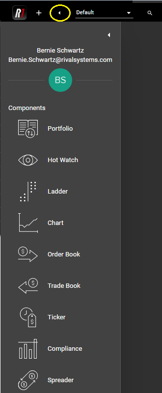
Once opened, the Component Panel will remain open to allow users to add multiple components. The same arrow will close the Component Panel when needed.
Individual components may now be added to the workspace window via drag-and-drop functionality. Click on the desired component and drag it into the workspace in the desired location.
The Rival One workspace makes use of all available space in the window by auto-sizing components. When dragging a new component into the workspace, users will see a preview outline of the component. The workspace autofit feature makes use of rows and columns within the window, so that users may rearrange their workspace in any configuration.
Adding a component as a new column:
Adding a component as a new row:
Once components have been added to a window, users may adjust their locations by dragging them from the component header. Users may also re-size components by clicking and dragging any edge of the component. When sizing one component, any other components in the window will automatically re-size to fit the window.
Quick Launch
In addition to the drag-and-drop functionality in existing windows, users can create new windows quickly from the Component Panel by double-clicking on the component icon. This action will launch a new window with that single component and will name the window according to the component. These quick-launch windows can be renamed at any time. Once created, the quick-launch window will behave as any other window in the workspace; additional components may be added, removed or resized as desired.
Main Search
The Main Search can be accessed from the taskbar in each window by clicking on the magnifying glass icon. Once exposed, users can search for instruments using a variety of different methods.

A. Searching by symbol
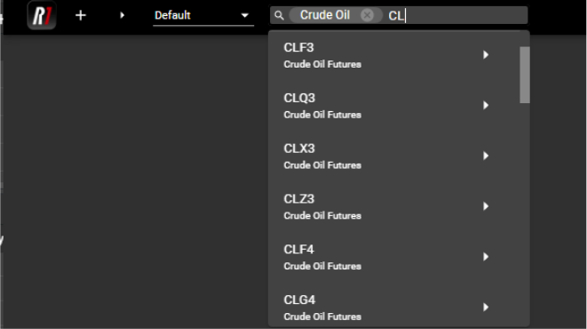
If the instrument symbol is known, typing that symbol into the search will yield all possible results containing the selected characters.
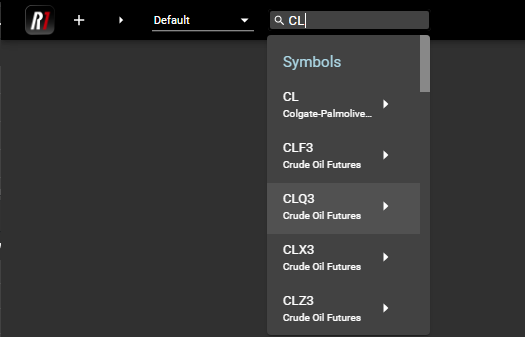
Note that due to the multi-asset nature of the Rival One application, users will often see multiple instruments listed with similar symbols. Underneath each instrument will be a short description in order to differentiate like symbols that may be used at multiple exchanges.
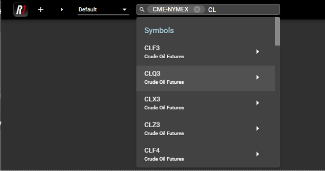
B. Searching by exchange or category
Entering the exchange name into the Main Search and selecting the desired exchange will narrow the possibilities:
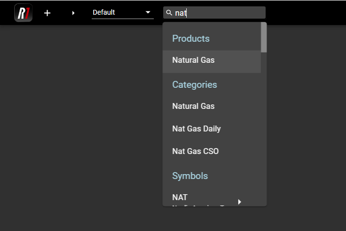
Users may also specify the category of their desired product first in order to refine their search:
Rival one also provides contextual search in the case that the symbol or exchange is unknown to the user. Any product or category containing the user’s entry will be displayed in order to provide assistance locating a specific product or instrument:
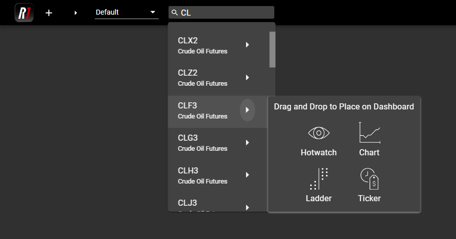
C. Launching components from Main Search
Once an instrument has been identified in Main Search, users may open a component directly from that instrument listing. Hovering over the arrow next to the individual instrument will expose a floating Component Panel. Users may drag and drop components into the workspace from here, pre-populated with the specified instrument. Components will behave in the same manner as they do when selected from the Component Panel, providing a preview outline as the user drags them into their window.
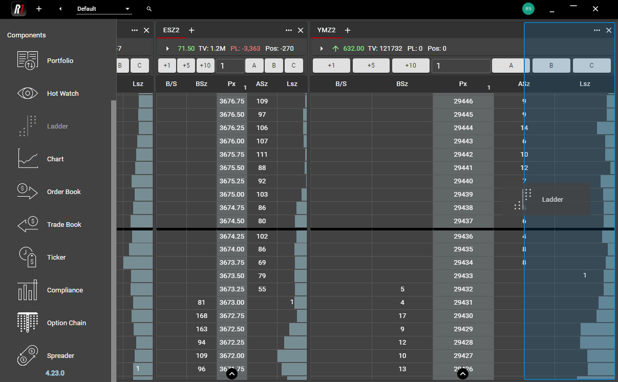
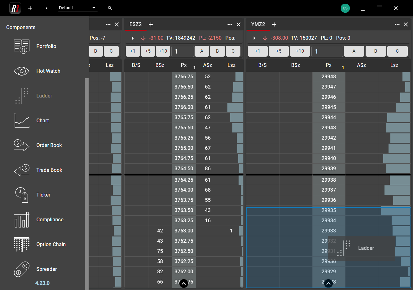
Linking Components
Components can be linked in order to provide additional workspace flexibility. All Components within a linked group will update when an instrument is selected or changed in an individual Component.
In each tab of supported Components, users will see a Link icon. By default, this icon appears Grey, meaning the tab or Component is not part of a linked group. Clicking on that icon will expose a color palette. Any Components or tabs which are assigned a matching color will be part of a linked group.
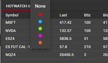
In the example below, Red has been selected as the linked group color and has been applied individually to a Hotwatch, Ladder, Chart, Order Book and Trade Book.
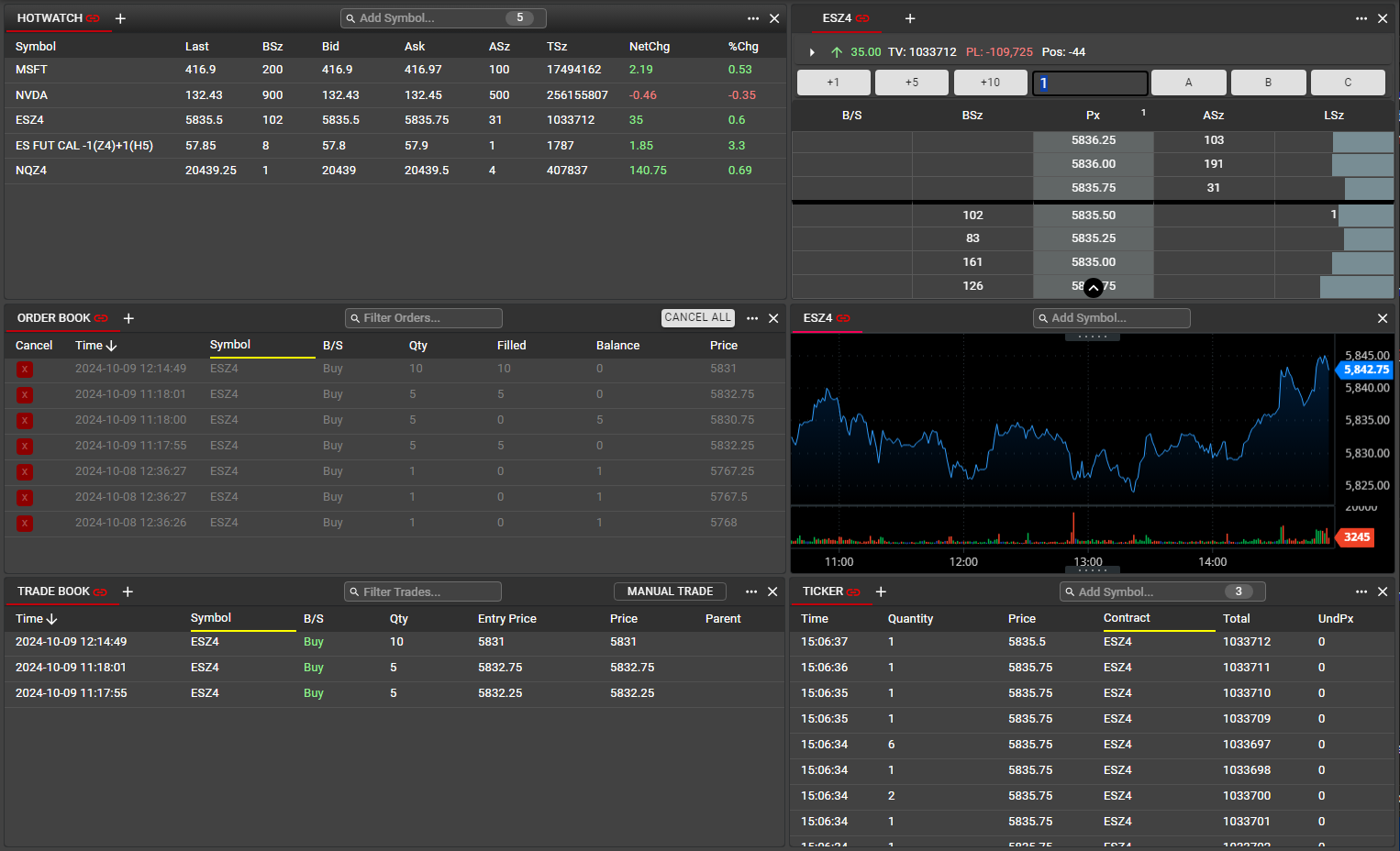
Any selection in Hotwatch will update all linked Components to display details for the selected instrument. Here, the user has clicked on ESZ4 in the Hotwatch. This will update the Ladder and the Chart to show ESZ4.
In Order Book, Trade Book and Ticker, selecting an instrument within a linked group will apply a filter to display information for only the selected instrument. By selecting ESZ4 in Hotwatch, these three Components are now displaying Orders, Trades and Time & Sales info, respectively, for ESZ4 only. Data for any other instruments in these Components has been filtered out.
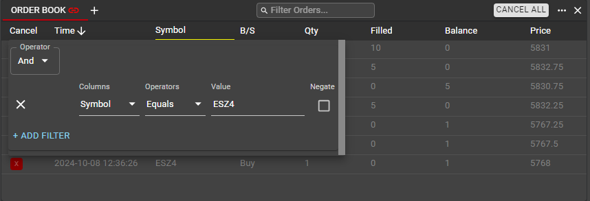
Within each filtered Component, the yellow underline indicates the column(s) on which a filter has been applied. Users can remove these filters at any time by opening the Filter control from the Component menu and deleting.
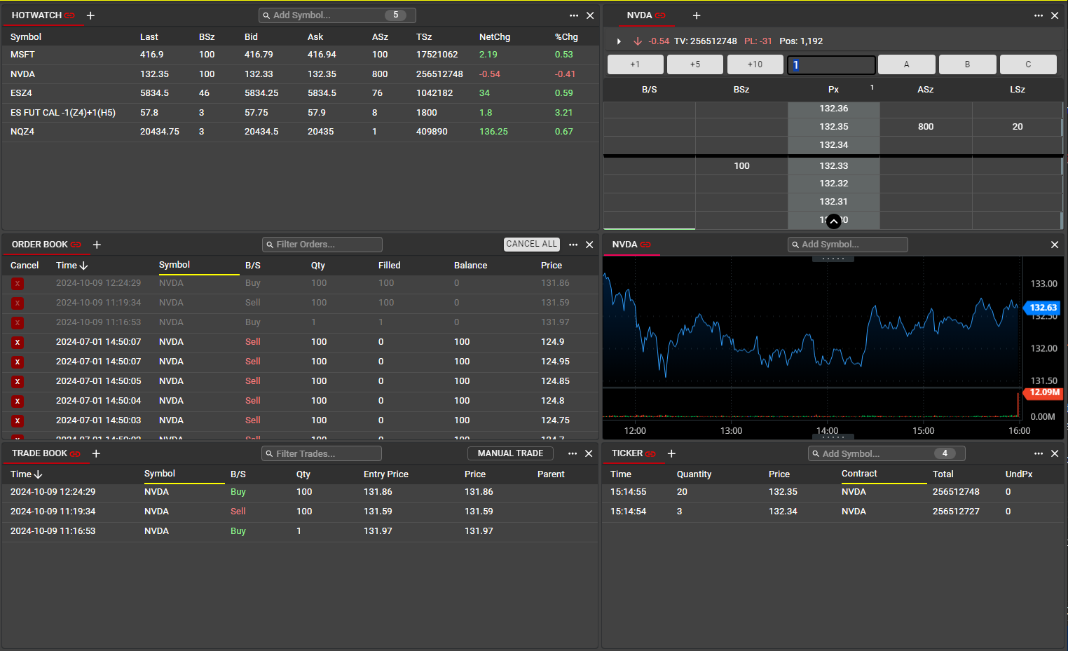
A subsequent selection from Hotwatch--in this case NVDA--will re-apply a filter for the newly selected instrument:
In addition, changing the instrument within the Ladder or Chart will apply the same filters to Order Book, Trade Book and Ticker.
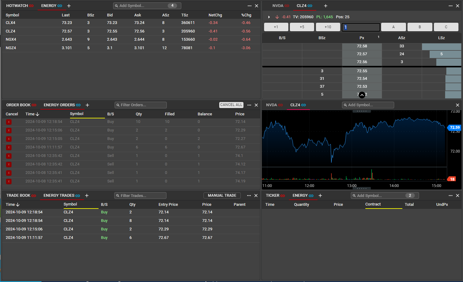
For additional workspace flexibility, linked groups can consist of individual tabs within a Component. In the example below, the user has added an additional tab to each Component in the workspace and has assigned Blue as the color for this new linked group. Any selections from a Blue tab will update all other Blue tabs in the window. In this manner, users may track multiple groups simultaneously within a window. Note Linking will only apply to Components within a single window and will not apply across workspace windows. For instance, a Red Hotwatch in Window 1 will not be linked to a Red Ladder in Window 2.
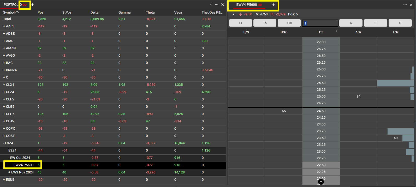
Portfolio may also be part of a linked group. In the example below, a linked group has been created consisting of a Portfolio and a Ladder. Clicking on an instrument in Portfolio will update the instrument in the linked Ladder. In this manner, users can quickly monitor and execute trades on instruments they have positions in currently. Notably, this can be done for Options as well as Futures and Equities instruments.
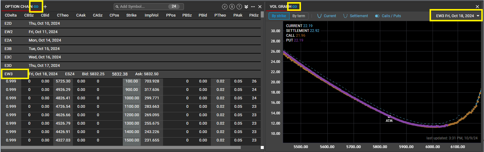
For users with Options permissions, the Option Chain can be linked to to Vol Graph. Clicking on a term header in the Option Chain will display the Vol Curve for the selected Term.
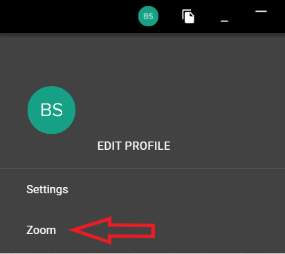
Zoom
Users can customize the appearance of their workspace by using Zoom. From the user menu in the workspace header, Select Zoom to expose the controls.
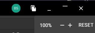
When applying Zoom, all content within the workspace is adjusted in a uniform fashion, including all text and fonts. In addition, users can apply Zoom using a keyboard shortcut.
CTRL + to zoom in
CTRL - to zoom out
CTRL 0 to revert to default size
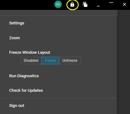
Freeze Window Layout
Individual windows within a workspace can be frozen. When a window is frozen, there can be no changes to the layout of the window. Components may not be added or removed and may not be rearranged. This can help to prevent unwanted component layout changes, which can be difficult to recover from.
Note that all activity within the components in a frozen window is still permitted. Users may add symbols to a component, place and modify orders, and drag symbols from one component to another.
By default, Freeze Layout is disabled in each window. Selecting Freeze or Unfreeze will expose a lock icon in the top right of the window. Once exposed, the lock icon can be used to toggle between frozen and unfrozen if desired.